What Signage Should I Have for a Start Up Business?
First impressions are critical for a new start-up business without recognizable branding and messaging. Your team will be busy developing a marketing...


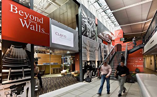
Architectural signs, including monument signs, wayfinding, and informational signage are found on both the exterior and interior of a building. They add a professional touch to your business’s overall appearance and coordinate with the materials in the surrounding environment to match your building’s architectural style. Well-designed signs direct potential customers to your business and throughout a space.
An architectural sign differs from common commercial signs, which are mass-produced and made of cheaper, less durable materials. Architectural signs blend in with the design or architectural style of a building often incorporating the same materials and colors as the rest of the building.
The most common architectural sign is a monument sign. This sign sits on the ground at the entrance to a parking lot or building and serves as a permanent landmark. A well-designed monument sign will make a great first impression and call attention to your building. The base of a monument sign is typically made from brick or stone, and the sign will come up to around five feet tall. Other architectural signs include custom wayfinding and directional signage designed to blend in with the space and utilize brand-specific fonts and colors.
When designing architectural signs, you should consider the purpose of each sign, the location it will be placed in, the materials found in the area around it and used in the architectural design of a building, as well as the business’s brand colors, fonts, logo, and messaging.
Here are some helpful tips to ensure your architectural signs are attractive and effective.
When designing a monument architectural sign, the business name is the most critical element to be included. However, adding more informational text to the sign could be beneficial. Drivers and pedestrians actually do read what is written on most roadside signs, so you should not be afraid to include the company slogan, a brief description, navigational directions, or other important messaging. Before you add more text to the sign design, though, check with local regulations, as some areas do not allow anything on a monument sign other than the company name.
Architectural signage must be custom-made for your business. You want your signs to have a uniform look matching the space and the company branding. Custom-designed architectural signs will last longer than commercial signage and will give a much more professional appearance, which can lead to customer trust in your company.
An architectural sign should be built to last. Outdoor signage must withstand the weather, elements, and intense sunlight. Choose materials that not only look good and blend with the environment but are waterproof and resistant to fading. Speak with a trusted sign manufacturer for advice on the best materials for outdoor signs.
While architectural signs need to match the building and location, they should also represent the brand. A company’s branding can be represented through the inclusion of the logo on an exterior monument sign or by using brand fonts and colors on architectural signage throughout the space. However, it is important to remember that any fonts used in sign design must be clear and legible, and colors should be bold and contrast with the backgrounds they’re placed on.
Visibility is critical with any business sign, and lighting is helpful in making any sign more visible. Monument signs should always be lit and visible. Consider adding LED lighting to the sign’s design. LED lights are energy-efficient, environmentally-friendly, and low maintenance. LED lighting can be placed within the sign or wrapped around the lettering or logo. Another option is to add spot lighting to the front of the sign. If your business stays open after dark, consider lighting for all the other signage on your building as well.
Before adding architectural signage to your building, be sure to look into any rules or guidelines your business will need to comply with. Some buildings and neighborhoods have strict sign requirements. Local professional signage companies should be aware of the rules in your area. There are also OSHA and ADA rules to consider as you want your business to be accessible to everyone in the community. When a business does not comply with local regulations, it can risk fines and the need for sign replacement.
Signage makes a big impression on visitors to your store or business. Cheap, commercial signs can make the company seem unprofessional, while custom architectural signage can give the appearance of a legitimate, successful business that cares about details.
Your company signage should be consistent and should represent the brand. Stick with recognizable brand-chosen fonts and colors while keeping in mind sign design musts, such as high contrast and clarity. When done well, architectural signage will elevate your company’s space and reputation with visitors and potential customers.

First impressions are critical for a new start-up business without recognizable branding and messaging. Your team will be busy developing a marketing...

Clear, easy-to-navigate wayfinding signage is crucial for any retail store. They may not be the first thing you think of when setting up a store, but...