3D Signage: Which Type Fits Your Business?
The signs that stand out the most in our minds are the ones that literally stand out. Dimensional signs grab viewers' attention and can help your...
3 min read
Craftsmen Industries Oct 18, 2022 4:44:00 PM


While digital signs are currently quite popular, non-illuminated signs can be just as noticeable and effective with the right design choices. On top of this, non-illuminated signage will cost less, you won’t have to fiddle with complicated LED boards, there’s no need for electricity, and there are fewer restrictions governing their installation.
Non-illuminated signs come in many forms, but unlike digital signs, they will not have an internal light source.
Non-illuminated signs can be made from a wide variety of materials depending on the placement and purpose. Here are some of the more popular options to consider.
Consider the height and angle of your sign. Signs should be placed so as to align with customer viewing angles, which are typically around 45 degrees above or below average eye level.
If you’re mounting a sign outdoors, you’ll want to choose a spot that gets plenty of sunlight during the day. Without an interior light source on the sign itself, you will need to consider the available light sources in and around your business. If well-lit areas do not exist around your building, consider adding additional spot lighting for the sign.
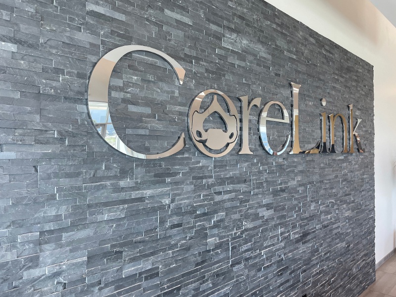
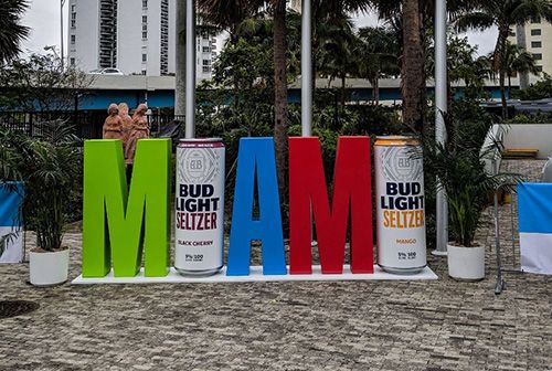
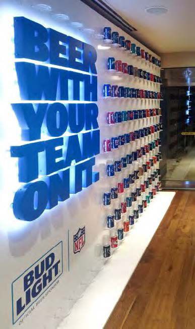
Creating a sign with dimension will help it pop. Our eyes are drawn to depth and contrast, and a well-designed dimensional signage can be as effective as an illuminated sign.
Dimensional signs are useful on storefronts, as well as any other indoor or outdoor locations. There are many three dimensional options, but the main types include
High contrast in sign design is always important, but especially so with non-illuminated signage. Contrasting colors are more likely to be seen at a distance or on a cloudy day. A sign’s readability owes a lot to the contrast of the text color against the background. Choose light or bright colors on a dark background or dark text against a white or light background.
You should also consider the building itself where the sign will hang. It needs to be in contrast with its surroundings. When hanging a storefront sign on a black building, a black or dark-colored sign is never going to be noticed.
Choice of font will also affect a sign’s readability, particularly when it comes to non-illuminated signs. You may wish to choose a unique and stylish complicated font to set your business apart, but simple fonts are the easiest to read. A swirly cursive font may not be legible to potential customers walking by.
Quality signage does the job of bringing attention to your business, attracting customers, and sharing helpful information and directions. If you decide to go with non-illuminated signs, keep these tips in mind to make sure your signs shine just as bright as illuminated options.

The signs that stand out the most in our minds are the ones that literally stand out. Dimensional signs grab viewers' attention and can help your...

A storefront sign is of the most important early investments a company can make. Usually the first sign your customers see, it should be...

Retail signage is everywhere. Whatever your business, you must invest in quality signs to grab attention, help visitors find you, advertise...