3 min read
Fleet Graphics: 5 Tips for Crafting Eye-Catching Designs
Craftsmen Industries Aug 3, 2021 8:11:00 AM


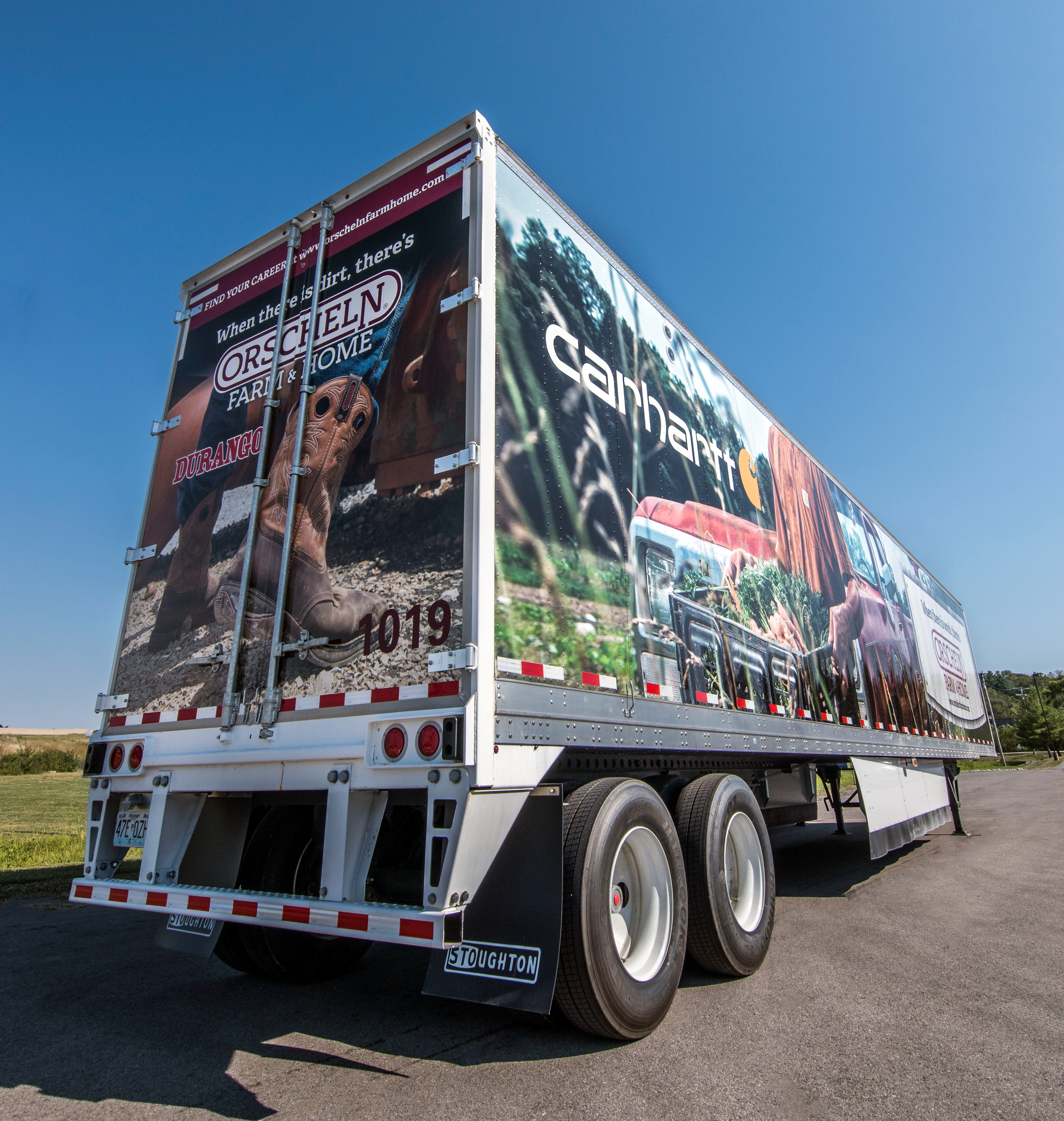
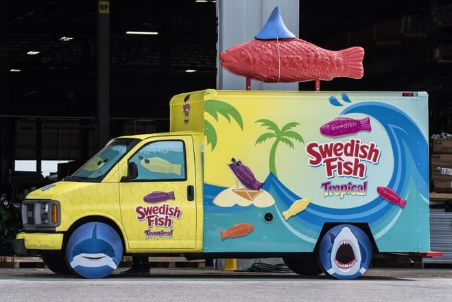
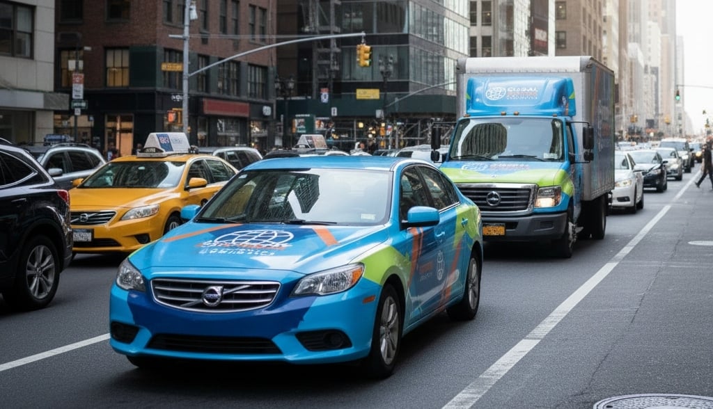
Clever, eye-popping design is imperative when adding graphics to your fleet vehicles. As drivers catch a glimpse of your cars or trucks on the road, they have mere seconds to take in the pictures and text you choose to display. If they are dull and boring, motorists will not notice them. On the highway, many other billboards and signs are competing for their attention. Catching their eye with its unique design and using those few seconds to communicate a message is the vital role that fleet graphics play.
In our last blog, we discussed how fleet graphics help your bottom line. In this article, we’ll talk about how to take your fleet graphic design up a level for the best results.
1. Properly Placed and Proportioned
Creating a design for the side of a vehicle presents a unique sizing challenge. Your text needs to be large enough to be read from a distance but small enough to be understood at a glance. Words that take up too much space leave little room for anything else and may get broken up by windows or door handles. Take stock of the available space on the vehicle. Identify contiguous open spaces for the most vital part of your message.
While most graphics appear on the roomy sides of vans and buses, it is essential not to overlook the real estate in the back. During rush hour, drivers may end up staring at the back of your company vehicle for miles with plenty of time to read it over and over, internalizing your message.
2. Avoid Overcrowding
If you have ever taken an art class, you are likely familiar with the concept of the focal point of a piece of art. Artists skillfully guide the eye of their audience to the subject of their work. Fleet graphic artists use the same principles to guide their work.
Combining too many words, pictures, and vivid colors creates a feeling of sensory overload. The audience does not know where to look first and may miss the whole point of your graphic. Make sure that there is a hierarchy in your design. The focus of the fleet graphic should be your message and your brand. All other words and images should be supportive but secondary.
3. Use High-Resolution Images
Have you ever tried to enlarge an image only to find out that your favorite 4x6 is pixelated and blurry when printed as an 8x10? The same principle applies to the graphics that your company uses for pamphlets and letterhead. If you try to use these same graphics to creates fleet designs, the pictures will come out fuzzy. It is worth the time and effort to touch up or redesign your company logo so it will look crisp and clear on the side of your vehicles. While you are editing it, you can optimize the size and shape for your fleet of vehicles.
4. Stay Consistent
Fleet graphics provide one of the best ways to enhance your company branding. Adding company logos, taglines, and colors makes your brand easily recognizable. To create an association between your company and your branding materials, they need to be the same across every platform. While your design may need to be tweaked a little for use on a vehicle, you should stick to the same design elements that make your company instantly recognizable on your website, social media, and retail locations.
It is best to avoid italics and script fonts for fleet graphics that require more concentration to read. A simple font whose style coordinates well with your products and services is best.
5. Make a Connection
They say that a picture is worth a thousand words. You do not have the luxury of explaining to your customer why your company is the best on the side of your truck. The graphics you choose need to speak for themselves. Pictures can evoke emotion and make a connection with those that see them—a connection that they will remember later when they are looking for a service provider.
Similarly, your tagline, though short and sweet, can make a lasting impression. People are more likely to remember it if it is creative, catchy, or made them laugh. Often, they will remember the way you made them feel long after they remember exactly what you said.
Professional Designs
Many companies have in-house graphic designers responsible for crafting pictures, logos, and visuals. However, if they have never designed graphics for a vehicle, they face a steep learning curve. Large format design for vehicle wraps is an entirely different medium than anything they have likely undertaken in the past.
The purpose of installing fleet graphics is to enhance your company's branding, stand out against the competition, and garner positive attention for your goods and services. To achieve these goals, you need graphics that truly stand out above the rest. You want the best design and the best product possible. A poor design works against you and wastes advertising money. An expert designer and knowledgeable installers like the ones at Craftsmen Industries, Inc. have the knowledge and experience to provide your company a superior product that will help emblazon your branding into the minds of all those who walk or drive by your fleet.

Maximize Your Mobile Workspace: Exploring Craftsmen's Mobile Office Trailer Features and Options
When designing a custom mobile office trailer, choosing the right features can make all the difference in ensuring a functional, comfortable, and...

How to Build a Cohesive Brand Identity with Fleet Wraps
Fleet wraps are more than rolling advertisements; they’re one of the most visible and cost-efficient tools for strengthening brand identity. Every...

