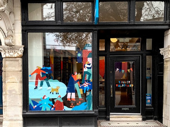
How to Wow with Window Graphics
A business’s storefront should grab attention and accurately represent the brand. Signage dresses up a space similarly to how furnishings and...


Placing signs and decals in storefront windows helps to attract customer attention, increase brand recognition, and is an excellent use of space. When designing the perfect decal for storefront signs there are a few things to consider.
Design choices, such as color, background, image graphics, fonts, and how much text to include can significantly enhance the effect of your decals. It is best to base your decisions on the window location, brand style, type of company, marketing goals, as well as the speed of local foot traffic. This last one may be something you hadn’t considered but can significantly affect the impact and comprehension of your decal.
Window decals can be a great signage option for temporary promotions, such as sales or seasonal messaging, as well as for more permanent signs, such as company logos, service information, and brand slogans. They are versatile, relatively inexpensive, and great for grabbing the attention of people who are walking or driving by.
Printed window decals can be easily installed and taken down by professionals allowing you to frequently update or change. Expert printers can make decals in any size, perfect for whatever window space your store or business has available.
What is the purpose of the window decal? Are you displaying a company logo? Conveying an important service? Communicating information such as opening hours? Promoting a special sale? Trying to attract new local customers walking by? Whatever the sign's aim, ensure all other design decisions reflect back on these goals. It is also important to consider any other marketing campaigns your company is currently running, as you will want all marketing materials to be cohesive.
Choosing the type of decal best suited for your store graphics depends on window location and how you want the signs to be viewed. Clear transparency signs work great for door and storefront signage that you want to be viewed from both inside and outside the building. Opaque backgrounds block sunlight and window visibility. These are perfect when you want to create privacy. Perforated decals will allow sign visibility on one side of the window and the ability to look through the window on the other. Frosted decals can give an elevated window look like etched glass.
When selecting colors for signs, first consider your branding. If your company has a set of branded colors, it may be wise to stick to these. There are, however, times when it makes sense to deviate. Certain colors improve visibility, especially on window decals and on specific backgrounds. For example, white text will be easiest to see on a transparent background.
Color theory also comes into play when designing signs. High contrasting color combinations will improve visibility, especially when there is text involved. For this, consider complementary colors, such as black and white, blue and orange, red and green, or purple and yellow.
Red and green, however, may not be the best choice for, say, a soothing spa. We collectively have associations with certain colors. Blue is understood as peaceful, red may be aggressive but is also often used to promote sales or grab attention, while white may feel elegant and upscale.
As previously mentioned, window decals can be printed for any window size. However, design choices will vary for different-sized signs. Are you designing a small sign to post store hours? If so, readability is of primary importance. If you have a large window to fill, you may focus more on eye-catching colors and graphics. Any large-scale design should immediately be recognizable with the brand.
How much vehicle and foot traffic does your building normally get? Additionally, how quickly are these potential customers typically moving? If your store is situated in a high foot traffic area, somewhere where people like to slow down, take their time, and window shop, you will be able to get away with more text in your window decal design.
If, however, foot traffic moves quickly around your store, or if traffic tends to be customers driving by, you’ll want to focus on low-text designs. Passersby will not be able to read signs with too much text. In this case, focus on eye-catching retail graphics, colors to grab attention, and brief messaging.
When designing any window sign, readability is the most important thing to keep in mind. What use is a sign that no one reads? On top of color choices, size, and length (or brevity) of messaging, there are other things that will also affect window decal readability.
Be sure that when placing your decal, it is always in good lighting. You may want to add indoor or outdoor lighting to make sure that the sign will be viewable at all times of day.
You will also need to consider how far away the reader will be from your signs. This will help you determine not only sign size, but the placement on the windows and the size and type of font you should use.
There is a lot to consider when designing the perfect window decal for your store or business. While all of the individual details that go into any sign design are worth considering, keeping purpose and readability as top priorities should lead you in the right direction. A window decal should grab the attention of a viewer going by and clearly let them know what you want to say.

A business’s storefront should grab attention and accurately represent the brand. Signage dresses up a space similarly to how furnishings and...

Decals are one of the easiest and most creative ways to spread brand awareness. Decals applied to vehicles, windows, walls, or even floors can become...

While customers are used to seeing signs hanging from ceilings on walls, windows, or shelves, floor graphics give you a chance to wow guests with...