3 min read
9 Original Ideas For Your Next Retail Graphics
Craftsmen Industries Aug 1, 2022 5:26:00 PM


Retail graphics are crucial to every outlet’s success. A store without graphics is like a fast-food restaurant without a menu. Apart from telling your customers what you sell, retail graphics provide an opportunity to advertise in creative ways. Here are some ideas to help you reimagine graphics for your business
1. Make it Experiential
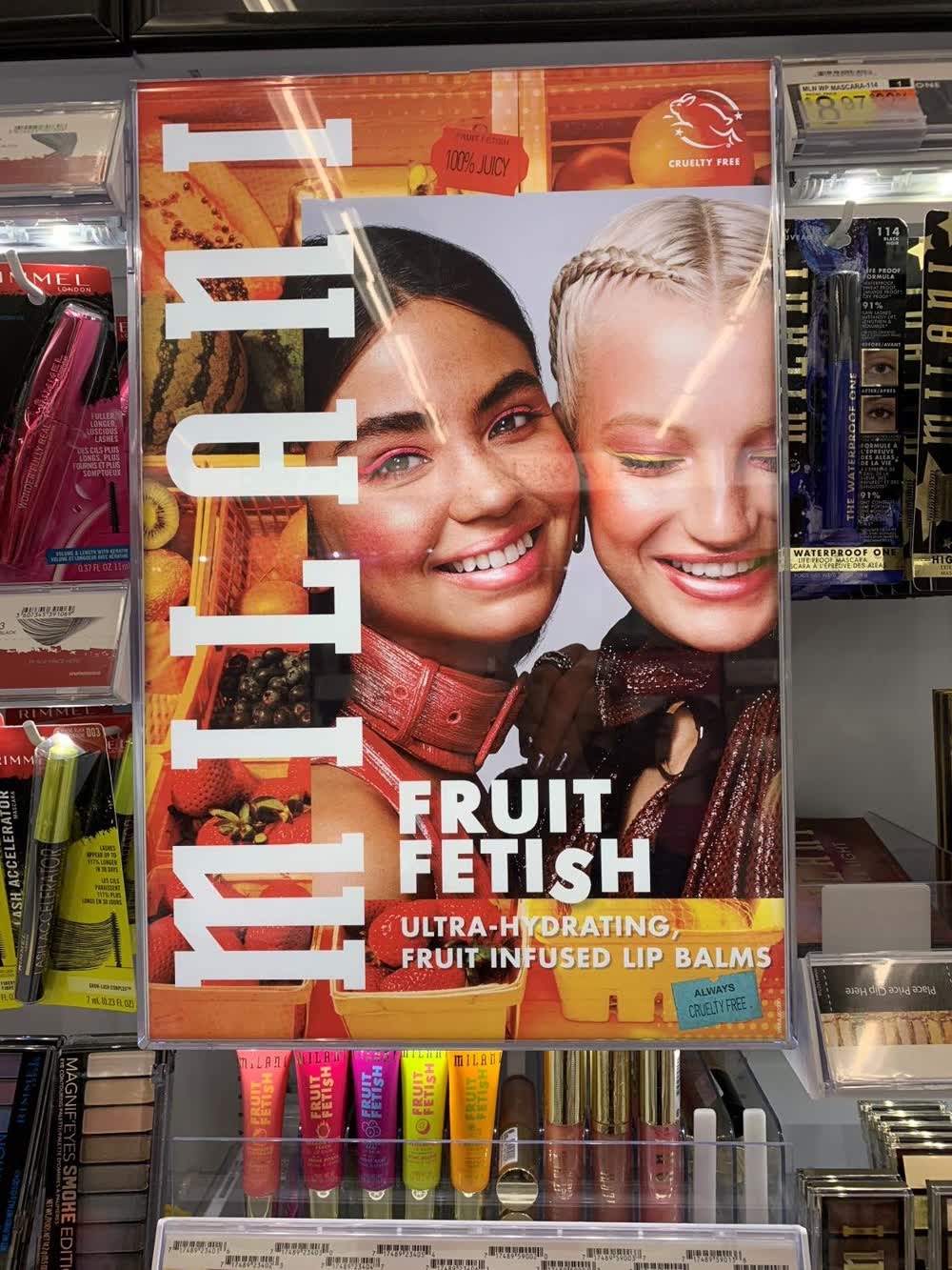
Graphics that cater to the senses in addition to sight enthrall and motivate consumers. Two senses that aren’t too difficult to engage are taste and touch.
Taste: Can your graphic make a person’s mouth water? This goal is relatively easy to achieve if you sell food. Otherwise, you might have to get creative. Maybe a pun like “Deals as sweet as candy” on a graphic of sweet treats or “Clothes that make you feel at home” on a picture of a lavish family dinner.
Touch: Can you make your retail graphic look like something someone would want to touch? Depending on your brand, it could be soft sheep’s wool, textured wood, or luscious moss. Of course, you can go the extra mile and actually make textured signs using 3D graphics printing technology. If you use retail graphics to convey an experience rather than relying solely on words, you’re doing great!
2. Let Go of Font Fever
Few businesses have done so well with their branding that their company name has become a verb as well like Google or Xerox. In 2015, Google changed its font to the superbly simplistic and readable font it uses today. Remember when Google’s letters looked like 3D shading? Try using the simplest font available for your retail graphics. Keeping it simple, keeps it readable.
3. Bigger is Better
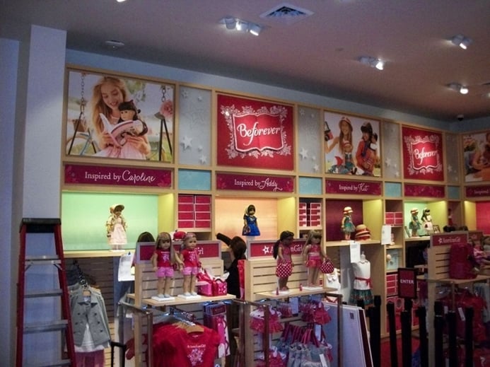
The size of your retail graphics makes an enormous difference in how many people pay attention to them. If you’ve run out of room along a wall, you could use custom wall graphics that wrap around the corner. Often retailers run out of horizontal space before they run out of vertical space. You might consider expanding vertically for a greater impact. How could you make your graphics bigger?
4. Try not to Laugh
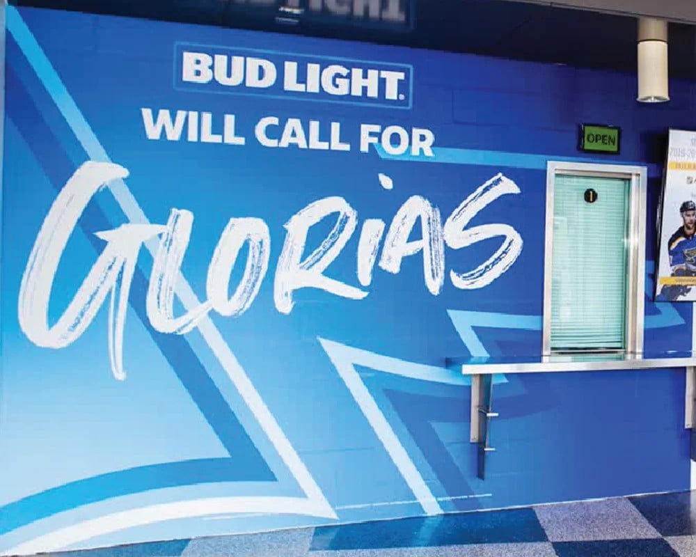
While humor remains a staple in TV and YouTube ads, designers often neglect it in retail graphics. It isn’t because laughter is ineffective. Most people enjoy a good laugh. It is most likely because it takes a little extra effort to create. It can also be challenging to use humor without accidentally offending someone. If you can get it right, however, humorous retail graphics are sure to make their mark.
5. Use a Period
Stop. You need to hear this. Now. Periods might seem like the most ordinary form of punctuation. In vinyl graphics, many retailers overuse exclamation points and question marks. A well-placed period can leave the message with finality, and it doesn’t appear like a blatant advertising ploy.
6. The Two Color Challenge
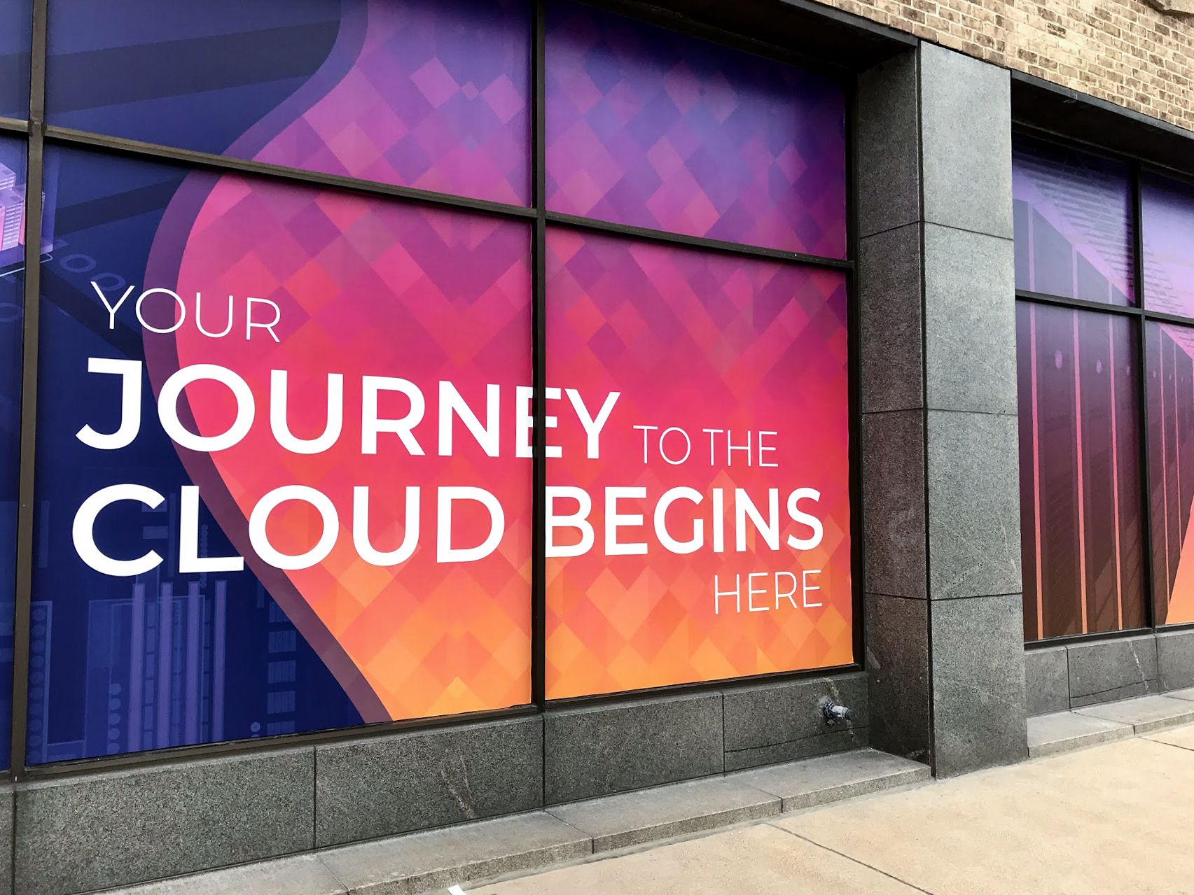
Colors catch attention, but in the retail world, too many colors often overcomplicate a display, making it more of an eyesore. Try limiting your retail graphics to two colors only. It sounds paradoxical, but by putting limits on in store graphics, you’ll automatically find yourself being more creative.
7. No Words, No Problem
Words are the easiest way to convey information, but they’re not the only way. How much can you say with symbols, images, and emojis? Taking the unconventional path with in store retail graphics will catch the attention of consumers. Graphics without words will give your store more character and a competitive advantage over neighboring retail shops.
8. Lead Them Along
Well-designed in store graphics lead customers through the displays and products you have available in a seamless path. Can you position and design graphics that make this path easy to follow? If someone comes in to look at the first product, how can you use graphics to draw them further into the store? Sparking their curiosity about deals and new products is a great way.
9. Answer Their Questions
Most shoppers have four questions when they enter a retail store:
- What is sold here?
- Where can I find the product I’m looking for?
- Why should I buy it?
- Is it a deal?
Try to create a retail graphic that answers these questions as briefly as possible. When telling them the price, customers love to know how much of a deal they are getting.
How do I know if retail graphics are working?
It isn’t easy to measure how effective graphics are. You might be able to judge their effectiveness by testing them on employees, walking around them yourself, or tracking whether sales increase after installing new graphics.
In the end, in store graphics are some of the most affordable yet most important types of advertising in your retail store. Be open to new, creative ideas and changing designs regularly. Hopefully, now you have some ideas on how to stand out and appeal to customers through retail graphics.

Wall Mural Ideas for Commercial Spaces
Wall art has always been a creative way to express your ideas and uniqueness. With numerous customization options, these graphics can be used for...

7 Businesses That Benefit from Window Graphics
Windows aren’t only for looking through. They can be a blank canvas for advertisements. Graphics on windows generate more impressions than those on...


