5 Reasons to Use Floor Graphics in Your Business
Does your organization have signs, graphics, and banners on your windows and walls? What about on your floor? Floor graphics can actually be very...


While customers are used to seeing signs hanging from ceilings on walls, windows, or shelves, floor graphics give you a chance to wow guests with unexpected messaging right at their feet. Floor graphics can be used as unique interior design elements, wayfinding, and directional tools, or attention-grabbing marketing pieces.
Placing store graphics on the floor does necessitate some unique design considerations. The materials used must be durable in high-traffic areas. Because of this consistent wear and tear, floor graphics are not meant to be permanent signs, which should be kept in mind when choosing designs.
Colors, graphics, and images must be eye-catching enough to direct a customer’s gaze to the floor. Text and messaging should be short and straightforward; something easily read while your guests step on by. Let’s explore more tips for designing the most effective floor graphics.
We all watch where we walk. Placing advertisements or other messaging at your customer’s feet is already going to get their attention. The unique location and temporary nature allow for a lot of design creativity.
The floor is an underutilized space when it comes to advertising. With graphics on the floor, you free up space in a building or store for products and people. Being able to step over a decal means no wasted areas.
Floor graphics are easy to self-install and are temporary, not permanent, signs, making them a cost-effective advertising solution. Because of this, floor graphics can be used to promote special events, seasonal products, and sales while keeping within budget.
Using floor graphics as directional or wayfinding tools can actually increase safety in your store or business. Floor graphics are a great interior signage option for leading the way to emergency exits, restrooms, etc. As an added safety bonus, vinyl on top of slick floor surfaces can actually create a safer floor, preventing guests from slipping.
Quality floor graphics can be used on any floor surface, including tile, concrete, and laminated floors, and can be placed both indoors and outdoors. Because they are low-cost and easy to install, they can be considered for all sorts of branding, messaging, and advertising needs.
Designing signs meant to be seen from above by viewers who are most likely in motion poses a unique set of challenges. Here are some design tips to help wow your guests.
Design decisions will be different depending on the purpose of your sign. Some creative ways of using floor graphics include:
Wayfinding:
There is no better way to guide guests through a store than by putting directions at their feet.
Interior design:
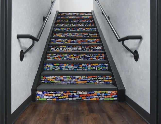
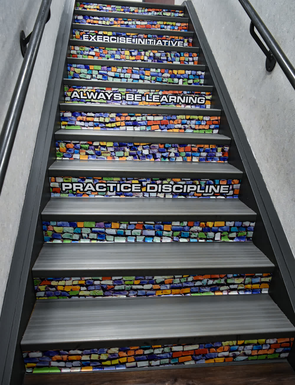
Large print floor graphics are an inexpensive way to add creative and impactful design elements. Consider faux floor finishes or underfoot murals.
Important messaging:
Whether you want to inform customers about a sale, seasonal promotion, or safety information, floor graphic messaging can get the job done.
Branding:
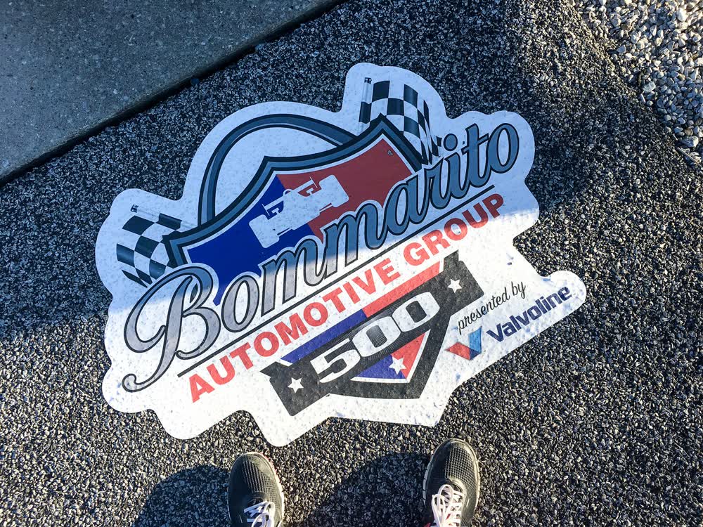
Consider messaging or graphics to enhance brand recognition. Brand slogans, recognizable imagery, or color palettes can help keep your company in the guest’s mind.
Optical Illusions:
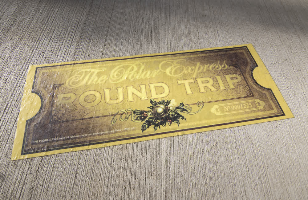
Floor signage can provide intriguing optical illusions. If this sort of whimsy fits with your brand, it can be a memorable touch.
Floor graphic placement should dictate design.
Depending on the location of your floor graphic installation, your viewer will most likely be in motion. If you're placing signs in corridors, aisles, entrances, and other areas of high foot traffic, your design should be short, simple, and quickly understood. Any messages that make a viewer stop in their tracks to read will cause traffic backups and potential safety issues. Consider directional messaging telling customers to keep moving and which way to go.
Consider elongating your graphic, especially when it comes to text, to compensate for the unusual angle of a sign viewed while approaching. For graphics placed in more open areas or spaces where viewers will be at rest, you will have the chance to use more detail as guests may linger to take them in.
Floor graphics, like any retail graphics, are an extension of the brand. Your company’s brand colors should be considered first. Exceptions to this rule are possible when branded colors don’t fit with the purpose of the sign. For example, graphics intended for safety should be bright and vibrant, being sure to grab attention.
Keep in mind that people have associations with specific colors. For example, red is often associated with sales, green may bring up thoughts about the environment, and blue can promote feelings of peace. For signs promoting specific products or services, you may want to use the colors associated with these products.
Floor graphics can be attention-grabbing simply by their unique placement at the customer’s feet. However, with thoughtful consideration made to design and placement, they will be exciting and impactful additions to your brand’s marketing strategy.

Does your organization have signs, graphics, and banners on your windows and walls? What about on your floor? Floor graphics can actually be very...

You might be wondering, “What are floor graphics? What can they be used for? Why are they important?” Keep reading to find the answers to these...

Many retailers use floor graphics in their stores. They help direct traffic, alert customers to sales, and compliment other branding. Have you ever...