How to Improve Customer Experience with Signage
If I asked you to tell me about the last piece of signage you saw in a store, how much would you remember? Would you be able to recall the name of...
3 min read
Craftsmen Industries Jul 5, 2022 11:12:38 AM


Brick-and-mortar businesses, from restaurants to hardware stores, all benefit from providing positive customer experiences. Businesses that double down on improving their in-store experience for customers enjoy positive reviews, recommendations to friends, and quality employee applications to name a few.
Although there are thousands of recommendations on how to create the ideal customer experience, not all of them, like building a gas station in the parking lot like Costco, are accessible to every business. Three tools accessible to every company operating in a brick-and-mortar building are customer journey mapping, interior signage, and providing a unique experience.
Customer journey mapping is a handy and relatively simple way to boost customer satisfaction. Every big brand uses some form of customer journey mapping to ensure customers aren't falling through the cracks and people feel looked after and treated fairly.
A customer journey map generally revolves around a diagram. The diagram displays each customer interaction with a brand as an individual step on their journey. Some classic maps include the following steps:
If companies ask themselves how they can improve each of these steps for a customer, they can enhance each touch point the customer has with the company. This type of thinking improves the customer experience and encourages customers to return and helps grow a successful business.
You can also create customer journey maps for specific brand-customer interactions. For example, brick-and-mortar stores might create a diagram focused wholly on the in-store experience:
This list is the classic customer journey in the majority of retail stores. But the steps will be different if you run a restaurant chain. Consider how to improve each of the steps. It's essential to ensure none of the steps have significant oversights. Even a perfect in-store experience won't make up for customers who can't find your store location in the first place.
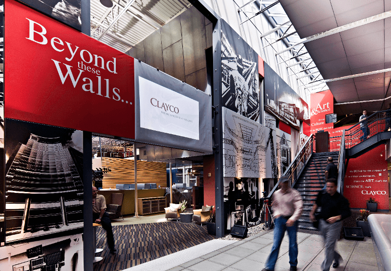
Interior signage is an umbrella term that includes many different types of in-store graphics, which may be used to direct traffic flow, advertise deals, brand your space, and appeal to customers' desires. For simplicity, let's focus on two of the most useful types of interior signage that improve customer experiences.
Architectural Graphics: Vinyl prints that cover an entire wall, wrap around pillars, or provide a backdrop for products and displays all fall under the broad umbrella of architectural graphics. These are useful to remind customers of the positive experiences your products can provide.
A ski rental shop might include an architectural graphic of a skier headed down a slope covered in a fresh coat of white powder, while a fast-food restaurant might choose to display mouth-watering, large-scale pictures of burgers along their walls.
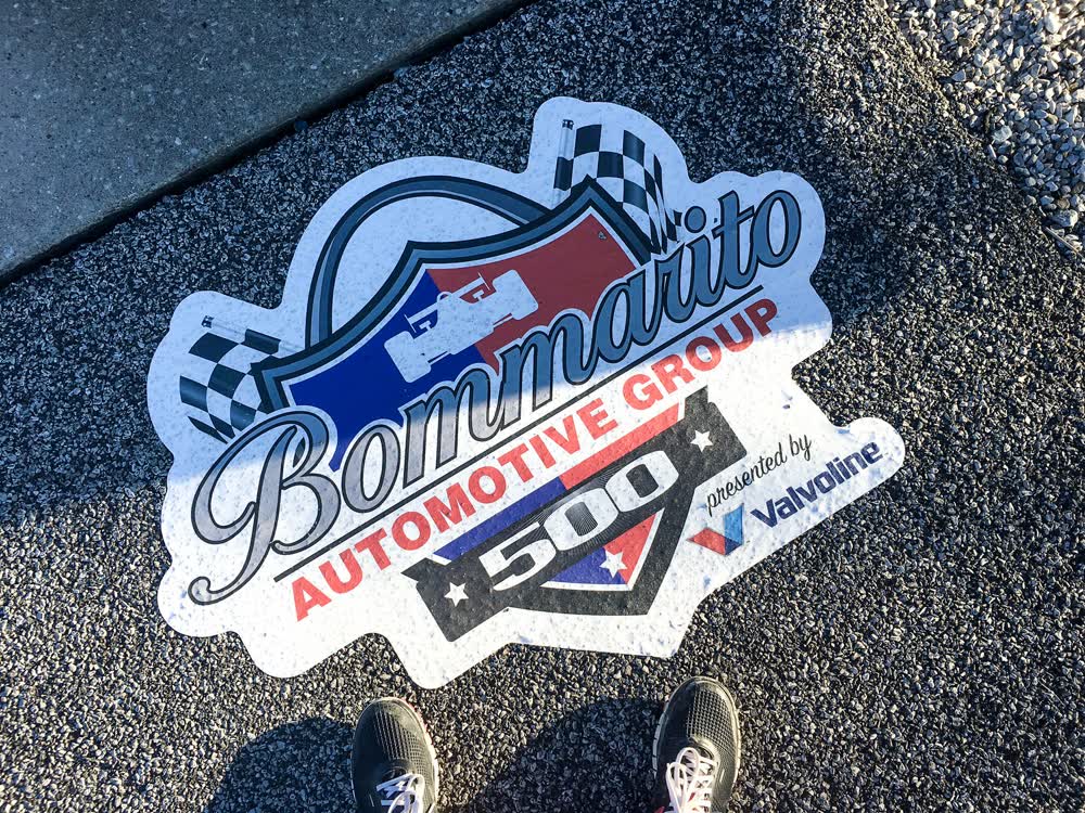
Floor Graphics and Decals: These are vinyl prints you place on the ground. Businesses often forget they can make graphics for the floor. Some of the benefits of well-designed floor graphics include:
A final tool for increasing customer satisfaction after visiting your store is adding something different than just the products for sale.
One store with multiple examples of this is Cabelas, with its recreated mountain, shooting range, fish tanks, and hunting trophies positioned around the building. All of these elements draw customers into different areas of the store, increasing the chances of them finding that one piece of equipment they never knew they needed. Rather than customers leaving disappointed when the item they were looking for is out of stock, most Cabela's customers have an enjoyable experience, making them more likely to return.
Another well-known example of adding something different is the McDonald's indoor playgrounds. Allowing rowdy kids to run around, climb up slides, and play, while waiting for their order. This play area is a big attraction for families. McDonald's playgrounds are so common that we hardly blink when seeing one these days. However, the conception and implementation of the first one was a bold and brilliant idea.
Building a 3-story mountain or playground in the center of the store might not be accessible to every outlet. Let's consider less extreme examples of stores adding a secret ingredient. Some ideas include:
What you offer doesn't matter as much as the fact that it is different. People like quirky and unique things and will return to show their friends.
In the end, customer journey mapping, interior signage, and your business's secret ingredient will take you a long way to creating a memorable and popular customer experience in your brick-and-mortar business.

If I asked you to tell me about the last piece of signage you saw in a store, how much would you remember? Would you be able to recall the name of...

When it comes to trade shows, work events, or promotional campaigns, success is never guaranteed. It’s not just the quality of the product that keeps...

Modern brands often struggle to break through digital noise and create lasting customer connections. Traditional ads fall flat, customer engagement...