Why are Interior and Exterior Signs Important for Schools?
While you may think about stores and businesses when you consider the importance of architectural signage, schools and other institutions also...
3 min read
Craftsmen Industries May 13, 2022 7:03:00 PM
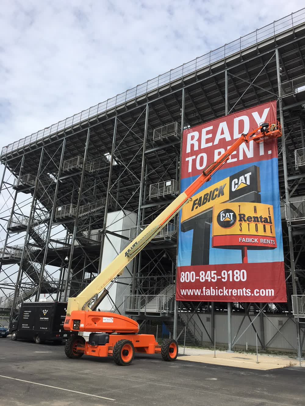
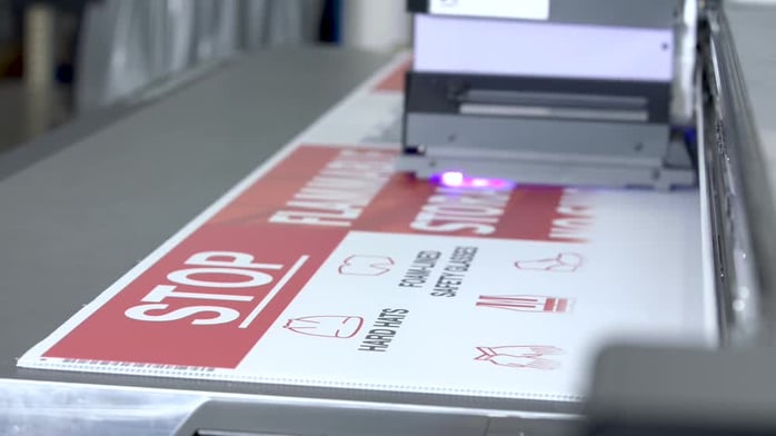
Vinyl signs are an excellent, cost effective way to advertise your business. However, if done the wrong way, your sign can drive potential customers away instead of drawing them in.
Here are the top mistakes other companies have made and how you can avoid them.
One of the most common pitfalls businesses fall into is choosing the wrong placement for their graphic. You can tell a sign is misplaced when it is:
Fix: Use the angles
One of the best ways to avoid poor banner placement is to look at it from all angles. If it faces the road, drive by it and walk by it. Look at it from across the street. If you can’t read it, nobody else will be able to either.
The renowned grammar software company, Grammarly, studied LinkedIn professionals to see whether fewer typos correlate with success. The results showed that “Professionals with one to four promotions over their 10-year careers made 45% more grammar errors than those with six to nine promotions in the same time frame.” Clearly, grammar mistakes can make or break your future.
Fix: Proofread
Avoiding typos doesn’t take a lot of time or resources. Simply have a second and even a third person quickly proofread your banner design before printing. Checking off little things like proofreading can save money on reprinting a whole design and allow you to move on to new tasks.
It’s so easy to add another image, statistic, or punchline. It’s much more difficult to delete information. However, savvy designers of custom vinyl signs know that less is more when it comes to advertising with banners and signs.
Fix: The ten-second rule
You should be able to read and understand a banner’s message in ten seconds or less. Anything that takes longer than ten seconds to get through won’t catch the attention of passing traffic or deliver its message.
It might make sense to fold your sign or banner when it needs to be transported or stored. However, folding leads to creases, cracks in the design, and a shorter sign lifespan.
Fix: Roll it up
Rolling vinyl is a much better way to store large vinyl signs. Rolling prevents creases and also helps you avoid ink on ink contact, resulting in the graphic sticking to itself and eventually coming off.
This is a technical one, but is nevertheless very important if you want a professional quality sign. RGB is the color model screens use to produce images. When printed, these files often look duller than they did on the computer.
Fix: Convert files to CMYK
CMYK files are bigger but result in much better printed images. The design appears as vibrant as the draft did on the computer. Choose a vinyl printing company that uses the best printing techniques for the best results.
This is a common mistake, especially for outdoor signage and building wraps. Somehow a four by six-foot sign looks enormous inside and tiny outside. Custom vinyl signs that are too small won’t be noticed and may fail to make the desired impressions.
Fix: Make a template
Measurements can be hard to visualize when it’s on a computer screen. Try using a sheet or a piece of cardboard. Cut it to the dimensions of your sign. You can even place it where the vinyl banner or sign will hang to see whether it’s truly as big as you imagined.
We’ve all seen this mistake before, whether it is a holiday sale, a new product release, or back-to-school banners. Advertising past events looks unprofessional. Even signs that don’t advertise a specific date need to be updated from time to time to avoid advertising outdated prices, products that are no longer new, or changes in logos.
Fix: Create an expiration date
Whenever you create a sign, also create a reminder in your calendar about when the sign is set to expire. Your sign doesn’t have to be down exactly on the date, but it is a good reminder to start designing a replacement.
Note: If you are careful, you can design some banners and signs to last almost indefinitely.
If a print design doesn’t account for printer error, the edges of a banner can often be cut off. This mistake makes the final product appear cheap at best and, at worst, incomprehensible.
Fix: Bleed your images.
This process is basically like putting margins on a sheet of paper. It allows the vinyl printer a margin of error and ensures that the large format printer will display the entire design.
Custom vinyl banners and signs represent your brand. When they are peeling or faded, it creates the impression of a cheap and unorganized company.
Fix: Invest in quality vinyl.
Not all types of vinyl are the same quality. Work with a large format vinyl printing company that uses the best vinyl available on the market. Even quality vinyl isn’t that costly. Although there are many cheaper alternatives, it is worth investing in quality to avoid creating negative impressions with your signs.
Banners and signs are a tried and true method of advertising that is available to all companies at a minimal cost. Not taking the time to create banners and signs leads to less brand awareness and reduced profit.
Fix: Craftsmen Industries
Craftsmen Industries is the solution you are looking for if you lack quality vinyl banners and signs. We are a large format printing company that works with a wide range of customers to branding their space in the most effective way possible. Find out more here or call and get a quote.
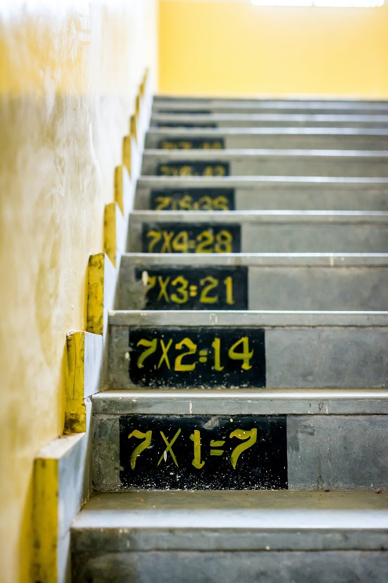
While you may think about stores and businesses when you consider the importance of architectural signage, schools and other institutions also...
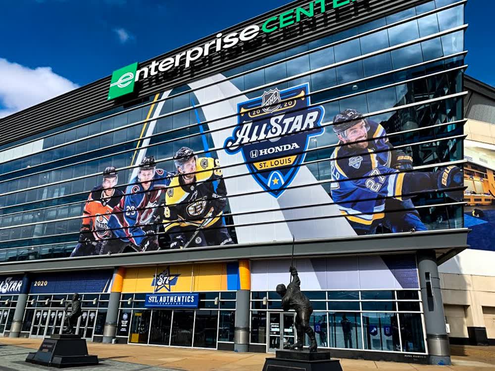
Architectural signs, including monument signs, wayfinding, and informational signage are found on both the exterior and interior of a building. They...
Clear, easy-to-navigate wayfinding signage is crucial for any retail store. They may not be the first thing you think of when setting up a store, but...